bubble-table alternatives and similar packages
Based on the "Advanced Console UIs" category.
Alternatively, view bubble-table alternatives based on common mentions on social networks and blogs.
-
-
Rich Interactive Widgets for Terminal UIs
Terminal UI library with rich, interactive widgets — written in Golang -
-
tcell
Tcell is an alternate terminal package, similar in some ways to termbox, but better in others. -
-
pterm
✨ #PTerm is a modern Go module to easily beautify console output. Featuring charts, progressbars, tables, trees, text input, select menus and much more 🚀 It's completely configurable and 100% cross-platform compatible. -
asciigraph
Go package to make lightweight ASCII line graph ╭┈╯ in command line apps with no other dependencies. -
termtables
DISCONTINUED. A Go port of the Ruby library terminal-tables for simple ASCII table generation as well as providing markdown and HTML output -
chalk
Intuitive package for prettifying terminal/console output. http://godoc.org/github.com/ttacon/chalk -
GCli
🖥 Go CLI application, tool library, running CLI commands, support console color, user interaction, progress display, data formatting display, generate bash/zsh completion add more features. Go的命令行应用,工具库,运行CLI命令,支持命令行色彩,用户交互,进度显示,数据格式化显示,生成bash/zsh命令补全脚本 -
yacspin
Yet Another CLi Spinner; providing over 80 easy to use and customizable terminal spinners for multiple OSes -
-
ctc
Console Text Colors - The non-invasive cross-platform terminal color library does not need to modify the Print method -
crab-config-files-templating
Dynamic configuration file templating tool for kubernetes manifest or general configuration files

InfluxDB - Power Real-Time Data Analytics at Scale


Do you think we are missing an alternative of bubble-table or a related project?


README
Bubble-table
A customizable, interactive table component for the Bubble Tea framework.
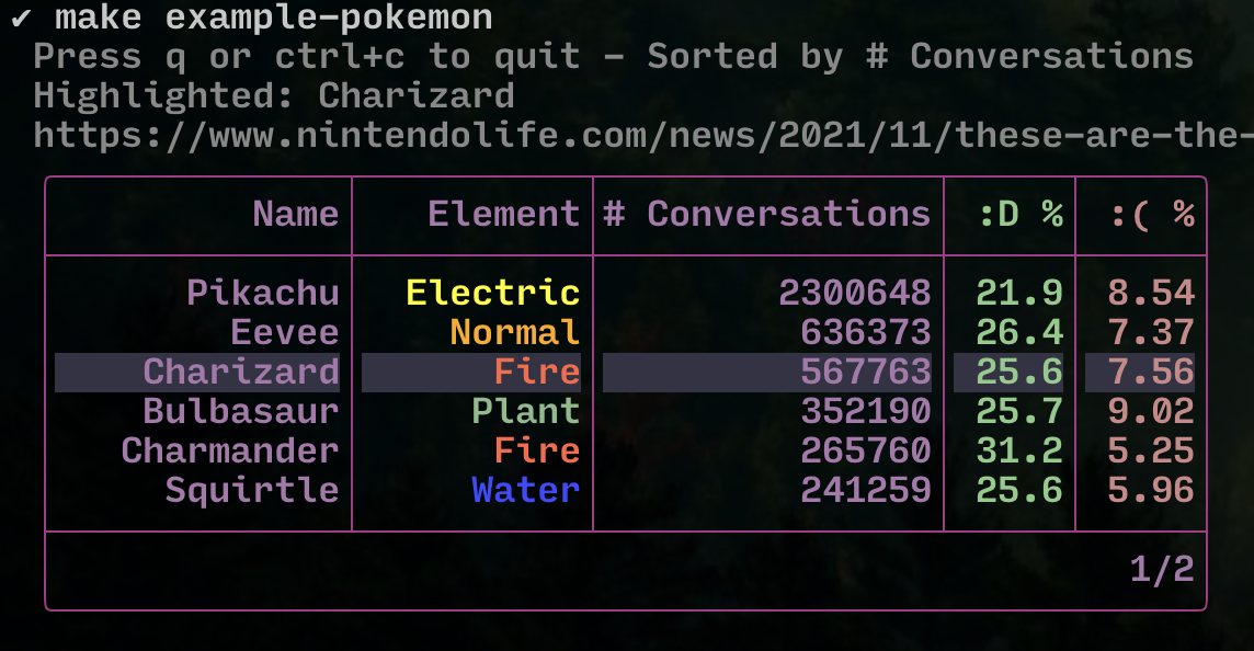
[View above sample source code](./examples/pokemon)
Contributing
Contributions welcome, please [check the contributions doc](./CONTRIBUTING.md) for a few helpful tips!
Features
For a code reference of most available features, please see the [full feature example](./examples/features). If you want to get started with a simple default table, [check the simplest example](./examples/simplest).
Displays a table with a header, rows, footer, and borders. The header can be hidden, and the footer can be set to automatically show page information, use custom text, or be hidden by default.
Columns can be fixed-width [or flexible width](./examples/flex). A maximum width can be specified which enables [horizontal scrolling](./examples/scrolling), and left-most columns can be frozen for easier reference.
Border shape is customizable with a basic thick square default. The color can
be modified by applying a base style with lipgloss.NewStyle().BorderForeground(...).
Styles can be applied globally and to columns, rows, and individual cells. The base style is applied first, then column, then row, then cell when determining overrides. The default base style is a basic right-alignment. [See the main feature example](./examples/features) to see styles and how they override each other.
Can be focused to highlight a row and navigate with up/down (and j/k). These keys can be customized with a KeyMap.
Can make rows selectable, and fetch the current selections.
Pagination can be set with a given page size, which automatically generates a simple footer to show the current page and total pages.
Built-in filtering can be enabled by setting any columns as filterable, using
a text box in the footer and / (customizable by keybind) to start filtering.
A missing indicator can be supplied to show missing data in rows.
Columns can be sorted in either ascending or descending order. Multiple columns can be specified in a row. If multiple columns are specified, first the table is sorted by the first specified column, then each group within that column is sorted in smaller and smaller groups. [See the sorting example](examples/sorting) for more information. If a column contains numbers (either ints or floats), the numbers will be sorted by numeric value. Otherwise rendered string values will be compared.
If a feature is confusing to use or could use a better example, please feel free to open an issue.
Defining table data
A table is defined by a list of Column values that define the columns in the
table. Each Column is associated with a unique string key.
A table contains a list of Rows. Each Row contains a RowData object which
is simply a map of string column IDs to arbitrary interface{} data values.
When the table is rendered, each Row is checked for each Column key. If the
key exists in the Row's RowData, it is rendered with fmt.Sprintf("%v").
If it does not exist, nothing is rendered.
Extra data in the RowData object is ignored. This can be helpful to simply
dump data into RowData and create columns that select what is interesting to
view, or to generate different columns based on view options on the fly (see the
[metadata example](./examples/metadata) for an example of using this).
An example is given below. For more detailed examples, see [the examples directory](./examples).
// This makes it easier/safer to match against values, but isn't necessary
const (
  // This value isn't visible anywhere, so a simple lowercase is fine
  columnKeyID = "id"

  // It's just a string, so it can be whatever, really!  They only must be unique
  columnKeyName = "何?!"
)

// Note that there's nothing special about "ID" or "Name", these are completely
// arbitrary columns
columns := []table.Column{
  table.NewColumn(columnKeyID, "ID", 5),
  table.NewColumn(columnKeyName, "Name", 10),
}

rows := []table.Row{
  // This row contains both an ID and a name
  table.NewRow(table.RowData{
    columnKeyID:          "abc",
    columnKeyName:        "Hello",
  }),

  table.NewRow(table.RowData{
    columnKeyID:          "123",
    columnKeyName:        "Oh no",
    // This field exists in the row data but won't be visible
    "somethingelse": "Super bold!",
  }),

  table.NewRow(table.RowData{
    columnKeyID:          "def",
    // This row is missing the Name column, so it will use the supplied missing
    // indicator if supplied when creating the table using the following option:
    // .WithMissingDataIndicator("<ない>") (or .WithMissingDataIndicatorStyled!)
  }),

  // We can also apply styling to the row or to individual cells

  // This row has individual styling to make it bold
  table.NewRow(table.RowData{
    columnKeyID:          "bold",
    columnKeyName:        "Bolded",
  }).WithStyle(lipgloss.NewStyle().Bold(true).  ,

  // This row also has individual styling to make it bold
  table.NewRow(table.RowData{
    columnKeyID:          "alert",
    // This cell has styling applied on top of the bold
    columnKeyName:        table.NewStyledCell("Alert", lipgloss.NewStyle().Foreground(lipgloss.Color("#f88"))),
  }).WithStyle(lipgloss.NewStyle().Bold(true),
}
A note on 'metadata'
There may be cases where you wish to reference some kind of data object in the table. For example, a table of users may display a user name, ID, etc., and you may wish to retrieve data about the user when the row is selected. This can be accomplished by attaching hidden 'metadata' to the row in the same way as any other data.
const (
  columnKeyID = "id"
  columnKeyName = "名前"
  columnKeyUserData = "userstuff"
)

// Notice there is no "userstuff" column, so it won't be displayed
columns := []table.Column{
  table.NewColumn(columnKeyID, "ID", 5),
  table.NewColumn(columnKeyName, "Name", 10),
}

// Just one user for this quick snippet, check the example for more
user := &SomeUser{
  ID:   3,
  Name: "Evertras",
}

rows := []table.Row{
  // This row contains both an ID and a name
  table.NewRow(table.RowData{
    columnKeyID:       user.ID,
    columnKeyName:     user.Name,

    // This isn't displayed, but it remains attached to the row
    columnKeyUserData: user,
  }),
}
For a more detailed demonstration of this idea in action, please see the [metadata example](./examples/metadata).
Demos
Code examples are located in [the examples directory](./examples). Run commands
are added to the [Makefile](Makefile) for convenience but they should be as
simple as go run ./examples/features/main.go, etc. You can also view what
they look like by checking the example's directory in each README here on
Github.
To run the examples, clone this repo and run:
# Run the pokemon demo for a general feel of common useful features
make

# Run dimensions example to see multiple sizes of simple tables in action
make example-dimensions

# Or run any of them directly
go run ./examples/pagination/main.go